White Space - Clean Design
Wikimedia Foundation
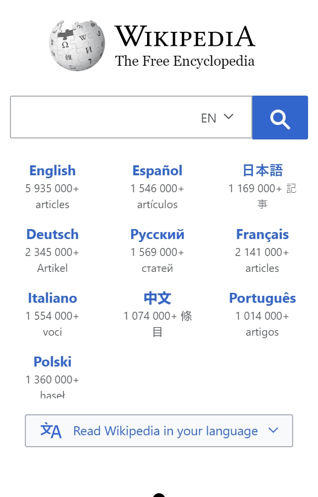
As you can see, each element on this web page is clearly defined. Everything is enveloped by white space. It’s predictable and pleasing to the eye. After visiting their desktop page, their idea of a clean look expands. In fact, the amount of white space is used to create symbolic imagery, like a globe with languages all around creating the idea that everyone in the world can use their site. In general, their page succeeds at making white space their foundation upon which to build upon. It’s almost as though you are walking into a crisp, and clean library full of fresh books.
PARC: Repetition
Kitchn Apartment Therapy
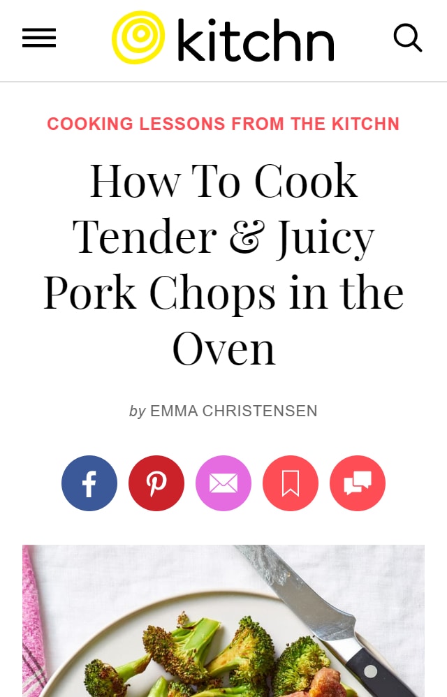
Looking at this page, your mouth might start to salivate, why? This page is filled with pictures of delicious pork chops all through out the page. This is their version of repetition, and it is done rather well. Would you look at this site differently if the recipe did not have any pictures? Sure. This aspect is directly related to helping the viewer know and understand how good the recipe is. This is how repetition works, it promotes a sense of comfort to the viewer, and helps them know that they are still on that page. Another example is the coloring of their text. That specific color accompanies you throughout the entire page. If the pictures, and repetitive colors weren’t there, you might feel bored and move away from the page.
PARC: Alignment
How-To Geek
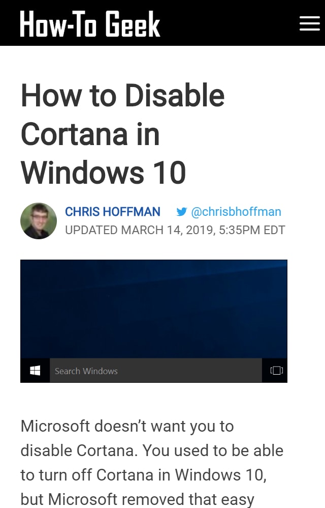
Notice how everything has a designated place? There’s an invisible edge to the left that draws your eyes further and further down the page. The short paragraphs, large headings, and lack of side menus really create a clean, and organized look. When visiting their desktop version of the page, each section is still lined up, but there is more to it. The clean left edge is more apparent due to the fact that none of the paragraphs are indented, which is something not completely noticed in their mobile version. However, this is naturally pleasing to the eyes. Alignment is all about showing the eyes where to look, and this page does just that.